A scientific journal article is crucial to scientific research because it is a way to convey information, results, and conclusions to large audiences. Furthermore, articles are records — blocks —that can build on each other. Before the present iterations of the journal article, researchers wrote essays and letters to disseminate their findings. It was not until the 1880s that the recognizable journal article (a document that has an introduction, methods section, results, and discussion) appeared; by the 1970s, this format was the dominant one in scientific journals. The journal article has not remained static, however, due to societal factors such as technology, policy changes, and mandates. In response to these factors, the scientific community has re-conceptualized journal sections, created new ones, and even created new article types articles. Technology has enabled the enhancement of journal sections through media such as video, animations, sound files, and interactive figures and has allowed journals to exist solely online.
The other night I was at a dinner party for my husband’s business, and a new acquaintance asked what I do for a living. I told him, and he said he wished he could use his professional skills to do something equally fulfilling. Experiences like that are a good reminder that leading a high-performing team in support of a meaningful mission is a privilege and a joy.
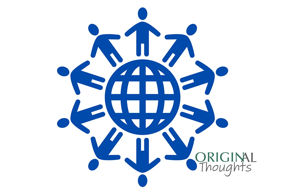
Global South authors face many challenges which can reduce their chances of publication success. Journal and publishing staff should become more aware of these challenges. There are many practical steps that journals can take to support Global South authors.
Peer review is the modus operandi of the scholarly publishing industry, with a purpose of increasing the quality and integrity of published content. There are multiple workflows for peer review, but double-anonymous peer review (DAPR) has been shown in numerous studies (examples here, here, here) to increase integrity by reducing bias. DAPR is the common peer-review workflow in the humanities and social sciences, beginning in the field of Sociology in 1955; it is used in many other fields as well. However, single-anonymous peer review (SAPR) is the most common workflow. Other models of peer review include triple anonymous, open peer review, post publication, and others (a more complete list with definitions is included in a nice graphic here).
Accessible content benefits everyone. Web accessibility conversations should start at the beginning of the design process. Include people with disabilities in all policy and process discussions.
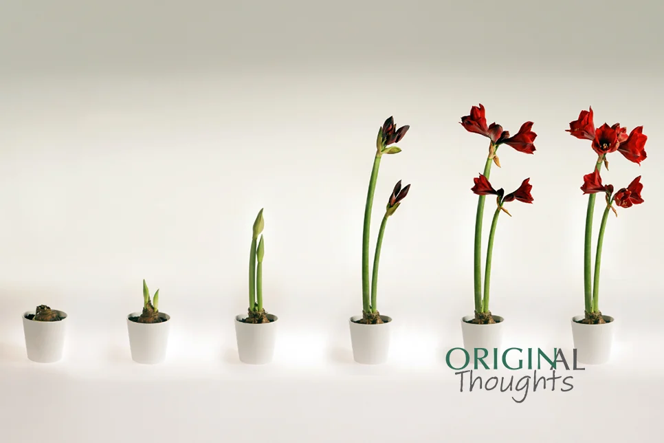
Introversion and extroversion are personality characteristics that exist on a continuum, with ambiversion falling in the middle. Introverts bring unique strengths to leadership positions.
Feeling the pressure at work? You’re not alone. Many of us struggle to balance workplace expectations with our own well-being. In today's post from ORIGINal Thoughts, author Randy Townsend MPS suggests that rather than let frustration take over, it’s time to Ctrl+Alt+Delete your stress.
Journals should prepare publicly available guidelines on the handling of special issues. Such documentation will spell out how a journal will control for ethicality and protect the validity of the peer review process.
Instructions can be a valuable resource, particularly if you pay attention to them. Whether you’re trying to replicate a mouthwatering recipe, assemble a holiday toy, or just use that new ‘thing’ that you’ve received, your goals are to do it quickly, do it right, and produce something valued and useful.