
Blog post
Designing Your User Experience Strategy: Part 1
20 May 2020

by Tracey Greene
Tracey Greene is the Chief Creative Director at Digital Artisans, KGL PubFactory’s lead design partner. In this three-part blog post series, Tracey shares valuable insights into maximizing discoverability and accessibility when creating your digital content platform.
Your website platform should be available to every person on any device. The following are critical considerations in a “mobile-first” world for maximizing discoverability and accessibility when creating the optimal user experience for journeys across all of your digital content.
Part 1: Resolution Matters
User Experience (UX) design must be mindful of resolution. In this “mobile-first” world of content, users are viewing content on a variety of devices with resolutions beyond that of desktop computers. It is imperative that your platform is viewed and tested in the different resolutions to ensure that usability and key performance indicators (KPIs) are met on any device.
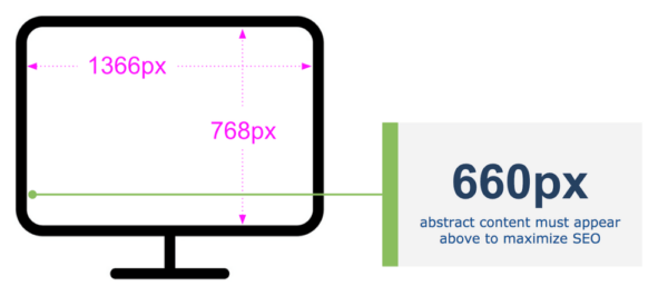
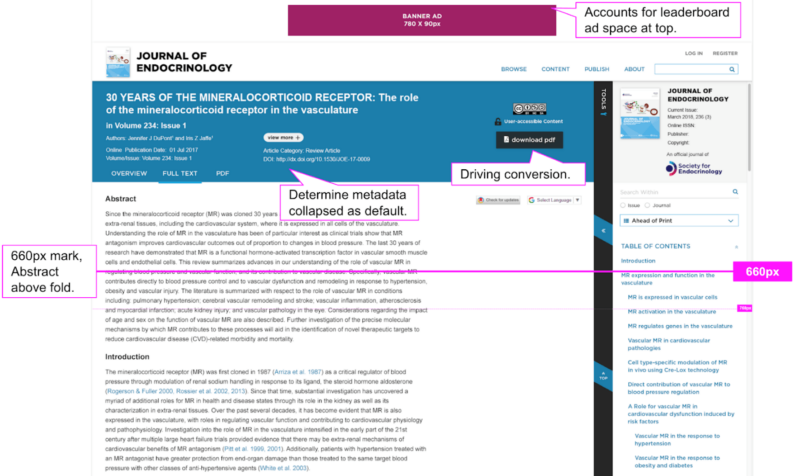
Abstract content must be above the Google Scholar “fold threshold” for SEO
For users searching for scholarly literature on Google Scholar, there is a threshold for optimal discoverability within search results. The standard baseline to use is the most typical laptop resolution. On a 13” monitor with a 16 x 9 ratio, any Abstract content must appear “above the fold”; that is, the tagged Abstract content that Google Scholar is seeking must appear on a user’s screen without the user having to scroll down to access it. Being mindful of the different browsers and their toolbars (e.g., favorites/bookmarks, search bar, tabs, etc.), your tagged Abstract content should be at least 660px or higher on the screen so that it is visible immediately – no scrolling necessary.
Maximize key elements to drive conversion
For every platform project, it is imperative to understand the most important goals and to ensure that metrics and measurements are in place to track their performance. Although a project can have many goals, you will need to prioritize them. For example, common goals include:
-
Providing efficient access to the “right” content
-
Making buying and accessing content as easy as possible
-
Delivering robust ad support that will at least maintain—and ideally grow—revenue
Referencing a baseline of UX and User Interface (UI) data prior to a new platform redesign or enhancement will result in a measurably better UI and the building of a proper hierarchy of actions. It also increases the likelihood of maximum findability of content and tools.
Having a solid data reference point also ensures accountability for returning metrics on important goals. For instance, the color and placement of a “download” and/or “buy” button should stand out and have strong visual hierarchy. Advertisements will have a better or worse click rate depending on their size and position on the page. Consider building flexibility into the UI and the platform to allow for A/B testing on specific UI elements like a “download content” button. Experiment with where the button is positioned, its color, or even what is stated on the button. This will help determine the best option for driving more conversions.
Optimize for readable content
In online publishing, it is important both to ensure a clear, efficient pathway to find content, and to ensure the readability of that content. Key page templates that must optimize screen real estate include search results, table of contents, and content pages (typically an article or chapter page).
There are core tools for each of the templates. Taking a mobile-first approach will help when designing their interactions and locations. For example, a “search results” template should include filters and a “search within” feature to narrow results, as well as sort mechanisms to organize the results displayed. In contrast, a “content page” template should provide access to bibliographic information, figures, references, etc. In both templates, additional tools might include sharing via social media and/or email, printing, and bookmarking.
It’s also critical to provide easy access to tools without diminishing the readable area—on both desktop and mobile devices. For instance, on content pages, the readable content should be the primary focus, with any tools being secondary. In laptop and desktop resolutions, having all of the tools visible to the user alongside the content is feasible as the long as the appropriate hierarchy is achieved. On mobile devices, there simply is not enough screen real estate to account for all elements on the screen at once, and this is where hierarchy of content to tools becomes even more important.
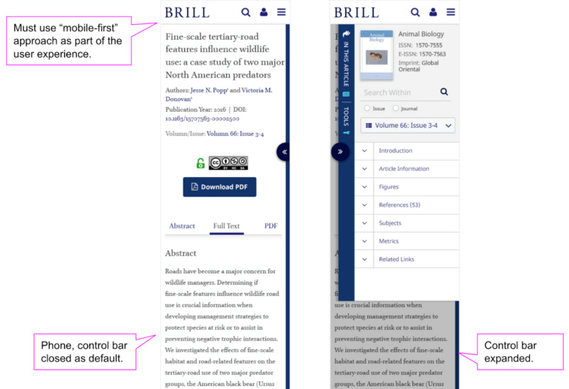
In the example below, techniques like sliders, picklists (i.e., drop-downs), and expand/collapse components have been leveraged to provide optimal readable experience for users with single-click access to tools. In this “mobile-first” design, the expand/collapse toolbar provides an optimal viewing solution for mobile users, but translates seamlessly for larger screens by automatically showing an expanded view. The location and access to the toolbar is familiar to users who access the platform in multiple screen resolutions, while leaving intact the goal of readable content.
Related Posts

The Shift to Outcome-Driven Learning: What’s Next for CPD and LMS Platforms

Succession by Design: Using Mentorship to Strengthen Both Reviewer Capacity and Board Engagement