Having a clearly written and transparent authorship policy on your journal website can have its benefits. For example, potential submitters will see what the journal expects of them, as well as what their responsibilities are, before they agree to submit to your journal. Because the policy is public, it will also be used as a tool in the Editorial Office when policy isn’t followed and will be easily referenced in communication with the author.

The United Nations Sustainable Development Goals (SDGs) have undoubtedly been among the hottest topics on the scholarly publishing agenda since we’ve come out of the pandemic.
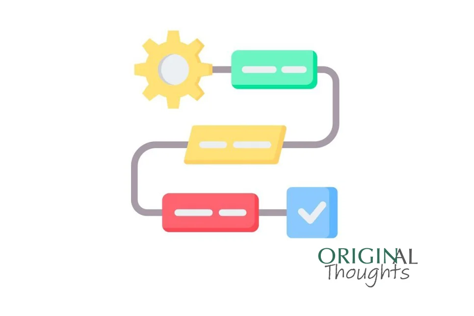
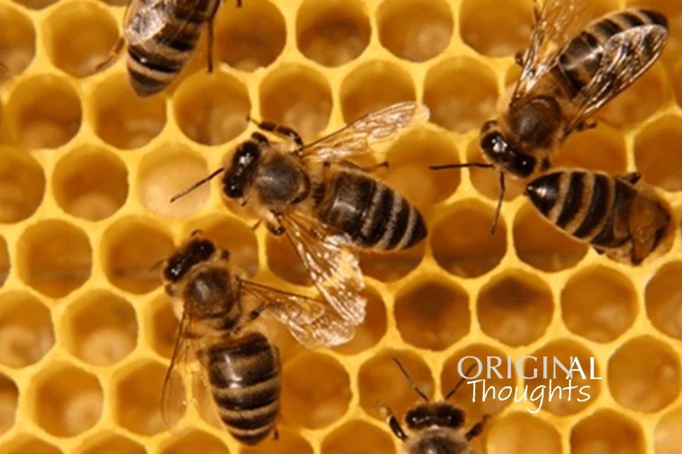
A journal’s workflow dictates how articles make their way through production and into an issue, and how those issues are compiled and released. Through my career in scholarly publishing, I’ve worked on journals that followed two types of workflows. Many journals use the more traditional issue-based publishing workflow, but increasingly, journals, especially online-only journals, use an article-based workflow. The information presented in this article is based on my experience working on two journals that follow an article-based workflow, both of which are published by Elsevier. Specifics may vary by publisher. This article is intended to offer some insight to editorial office professionals about article-based publishing and is not intended to suggest or imply that article-based publishing is inherently better or worse than an issue-based workflow. Speak with your publishing partner if you think an article-based workflow may be a good fit for your journal.

Policies are the foundation that we build our workflows on in the editorial office. Policies are a set of rules for your journal to follow to retain consistency in your procedures and workflow. Think of them as a houseꟷyou need to fill your house with the things that will help you live. Throughout the course of this series of posts published over the next several months, we will explore policies that should be established in an editorial office. Policies can be simple or elaborate, but should ultimately help effectively support your authors, reviewers, editors, and editorial office. Just like your chairs and table support your dinner and your computer, your policies should be able to support your editorial office.
Over the last decade, in response to a changing, better-informed world, the publishing industry has taken steps to bring more diversity into the workforce as well as to make its content more inclusive.
Following the release of the Nelson Memo late last summer from the U.S. Office of Science and Technology Policy (OSTP), the industry has been buzzing about the potential effects these recommendations regarding U.S. federal funders’ policies will have on access to federally funded research. Will the recommendations force hybrid and subscription-based journals to flip to Gold Open Access or can these journals’ business models survive and still be in compliance with the U.S. funders’ expected policies of immediate public access? How will these changes be implemented? Where will the funding come from for authors who want to pay APCs to make their articles immediately publicly available? I will leave those questions to the Scholarly Kitchen, as the chefs have done a lot of thoughtful pondering on these subjects in recent months.
Looking to the year ahead once again, the KGL experts across book and journal publishing, scholarly and education markets, technology and business development, weigh in to highlight some of the industry trends we expect will be prominent in 2023.
Globalization is not, by any stretch of the imagination, a new trend. For decades, our world has steadily become more interconnected and, without doubt, this is a pattern that is set to continue long into the future.
Box plots are an excellent way to show detailed information about data with a range of values. Editorial office personnel are often asked to report on key indicators for their journal which do not inherently have a single value, such as the time to initial decision.