Sometimes a journal’s list of requirements may seem daunting, especially when authors are eager to have their latest research published as soon as possible. Is it necessary that every submission adhere to all established policies? In a word, yes. But why? Policies like those described below are meant to protect not only journals, but also authors, to prevent discrepancies, disagreements, or even legal issues after publication. Policies are usually created because of an issue that has arisen at a journal in the past. When possible, journals should be proactive in their policy creation and then revisit policies routinely. For the sake of transparency, it is crucial that a journal clearly defines all its policies so that authors are fully informed of the expectations prior to submitting.

Figures should be easy to understand by the article’s intended audience and able to stand-alone (i.e. be understood without reading the text). To achieve this, authors need to pick the right visual representation for a data set and the message to be conveyed.

Journals are struggling to secure peer reviewers. The process is slow, cumbersome, and inconsistent in terms of delivering on the promise of guaranteeing validation and ensuring published research is of a sufficient quality to enhance our understanding on a given topic and allow for reproducibility. But the typical journal management of reviewers is entirely transactional: reviewer is asked to evaluate a manuscript, reviewer provides comments, everyone moves on. With obvious motivations to review diminishing in the eyes of some reviewers, should journals do more to give back and reward the hard work of their reviewers? One approach might be for journals to offer training, especially for early-career researchers. After all, learning how to evaluate a manuscript develops eminently transferable skills that can, in turn, improve authoring and study design proficiencies.

Having a clearly written and transparent authorship policy on your journal website can have its benefits. For example, potential submitters will see what the journal expects of them, as well as what their responsibilities are, before they agree to submit to your journal. Because the policy is public, it will also be used as a tool in the Editorial Office when policy isn’t followed and will be easily referenced in communication with the author.
A journal’s workflow dictates how articles make their way through production and into an issue, and how those issues are compiled and released. Through my career in scholarly publishing, I’ve worked on journals that followed two types of workflows. Many journals use the more traditional issue-based publishing workflow, but increasingly, journals, especially online-only journals, use an article-based workflow. The information presented in this article is based on my experience working on two journals that follow an article-based workflow, both of which are published by Elsevier. Specifics may vary by publisher. This article is intended to offer some insight to editorial office professionals about article-based publishing and is not intended to suggest or imply that article-based publishing is inherently better or worse than an issue-based workflow. Speak with your publishing partner if you think an article-based workflow may be a good fit for your journal.
Policies are the foundation that we build our workflows on in the editorial office. Policies are a set of rules for your journal to follow to retain consistency in your procedures and workflow. Think of them as a houseꟷyou need to fill your house with the things that will help you live. Throughout the course of this series of posts published over the next several months, we will explore policies that should be established in an editorial office. Policies can be simple or elaborate, but should ultimately help effectively support your authors, reviewers, editors, and editorial office. Just like your chairs and table support your dinner and your computer, your policies should be able to support your editorial office.
Following the release of the Nelson Memo late last summer from the U.S. Office of Science and Technology Policy (OSTP), the industry has been buzzing about the potential effects these recommendations regarding U.S. federal funders’ policies will have on access to federally funded research. Will the recommendations force hybrid and subscription-based journals to flip to Gold Open Access or can these journals’ business models survive and still be in compliance with the U.S. funders’ expected policies of immediate public access? How will these changes be implemented? Where will the funding come from for authors who want to pay APCs to make their articles immediately publicly available? I will leave those questions to the Scholarly Kitchen, as the chefs have done a lot of thoughtful pondering on these subjects in recent months.
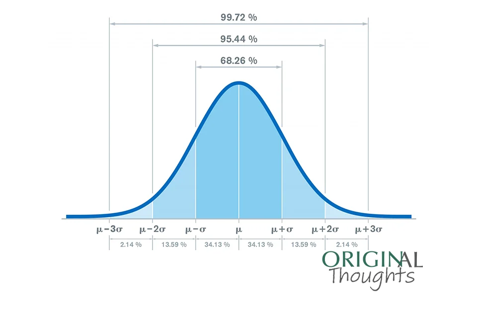
Box plots are an excellent way to show detailed information about data with a range of values. Editorial office personnel are often asked to report on key indicators for their journal which do not inherently have a single value, such as the time to initial decision.
Are you reporting what you think is a key value in your performance reports? Does that statistic tell the whole story? Does your audience take away a full data-derived understanding of your journal stakeholder behaviors? Are you basing processing protocols off data points without full context?